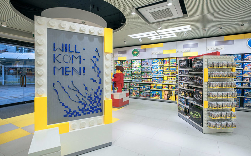
A brand new LEGO® store has opened in Stuttgart, Germany today and it appears to introduce a new in-store design standard. Although many LEGO stores offer unique elements due to ther location or size, most standard stores follows a very similar visual design. This new store opening isn’t a flagship store like Leicester Square or Amsterdam, so it could offer the first look a a refreshed in-store experience for standard stores. The new design tones down the yellow with a splash of grey, with fitting and fixtures being crafted to look like oversized LEGO elements. It looks like more modern retail experience, whilst also maintaining the fun of the LEGO brand. It remains to be seen if current stores will be refitted to follow this new design or this new store is being used as a concept. Supposedly the digital ribbon featured in the Birmingham store was due to be used in future stores, but doesn’t appeance in Stuttgart. Regardless I like this new design, it feels a little more relaxed. To learn more about the new German store opening head over to Zusammengebaut.
Author: Adam White
Howdy I'm Adam, The editor of BricksFanz.com - your go to source for the latest LEGO news, reviews and much, much more. Some of you may know me from other LEGO sites so you'll know I have a good experience of the LEGO community and a deep, passionate commitment to all things LEGO. I specialize in seeking out the latest LEGO news and products, as well as being an expert on all things LEGO gaming. So welcome to BricksFanz - Fuelling Your LEGO Lifestyle.
1 Comment
Submit a Comment Cancel reply
This site uses Akismet to reduce spam. Learn how your comment data is processed.






30th April 2021
This looks remarkably like the new design for the “Big Shop” at Legoland Windsor.