The LEGO® logo is one of the most recognisable in the world as are many of the ones used to denote the various LEGO sub-themes such as City, Friends and Technic. All of which have remained largely unchanged since their inception. However, LEGO DUPLO likes to get a new lick of paint a little more often. With the brand getting a refresh this year, here’s a nostalgic look back at the past logos as well as the jazzy new one.
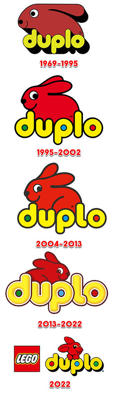
LEGO DUPLO began life in 1969 as an extension to the core LEGO product line. The DUPLO sets were aimed towards the youngest builders aged 1 ½ to 5. The DUPLO bricks are much bigger than standard LEGO ones, but employ the same sort of buildable system, associated with LEGO sets. With elements being bigger they can’t be swallowed but they are still compatible with normal-sized bricks, thanks to the hollowed-out studs. DUPLO has also had a brand mascot since the very beginning, a red rabbit. From the late ’60s until today, the rabbit has remained from and centre in the DUPLO logo, even surviving a couple of attempts to completely rebrand the product range.
- The launch of DUPLO brought about the first logo and the DUPLO rabbit. This logo remained in use until the mid-90s.
- In 1995 the logo was refreshed and matched a newly introduced preschool product line called LEGO Primo. This logo featured a friendlier version of the DUPLO rabbit and a little more colour added to the lettering, it was used until 2002 when the DUPLO brand was dropped in favour of LEGO Explore.
- But you can’t keep a good rabbit down and LEGO DUPLO was brought back two years later in 2004, along with LEGO Baby and LEGO QUATRO. The logo remained largely unchanged, but for a slight tweak to the rabbit.
- In 2013, the LEGO DUPLO logo got a much bigger redesign. The rabbit remained but was flipped and the DUPLO lettering was made chunkier and given a little texture. This logo has lasted until now and appears on current sets releases on January 1st, but branding on retailer LEGO portals and in LEGO marketing material introduces an all-new logo.
- The new logo rolls the lettering back to something similar to that used in the ’90s with the famous red DUPLO rabbit getting a complete redesign. It now looks like a Disney character and leans on the logo instead of peeking from behind it. I’d expect this to start appearing on packaging later this year, most likely in March when the next wave of sets are due to launch.