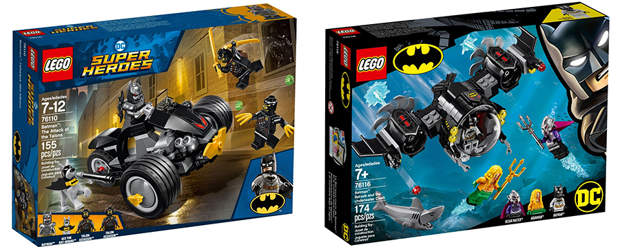
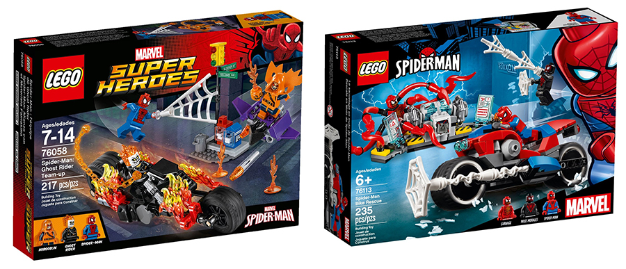
In recent years LEGO® sets from many themes have arrived in a similar style of packaging. Logo in the top left, character art in the right and action shot of the set you’ll find within. But this year LEGO have given their packaging a rather cool refresh. It was first shown in some of the super hero sets, gone is the Marvel or DC Comics Super Heroes branding, in favour of the relevant characters so sets are known LEGO Spider-man or LEGO Batman.
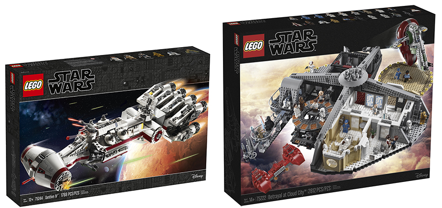
Even themes which haven’t had as drastic a change to its artstyle, as some of the other sets here, have still been give a visual tweak. This is most apparent with the LEGO Star Wars sets. The plain background borders of the box now feature a cool little LEGO greeble background. Standard sets are the same, using white in place of the black found on larger UCS or MBS sets.
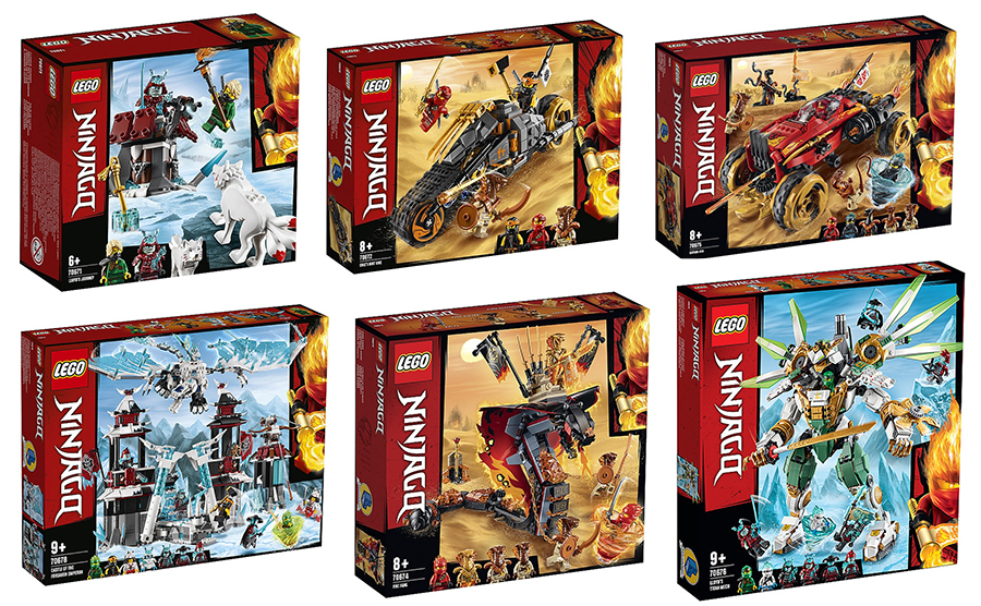
But it is the artstyle of some of the upcoming sets which has really been overhauled. The new Summer wave of NINJAGO sets, nicely switches up the design of boxes a great deal. The NINJAGO logo is flipped along the left side of the box, with the set image overlaid with jazzy graphics, almost in a comic book style layout.
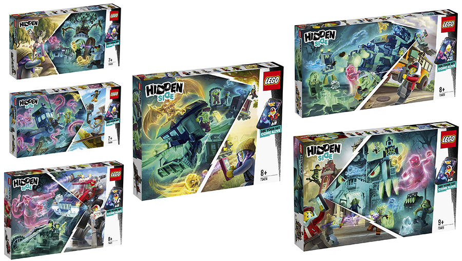
Then there’s the Hidden Side sets, which really stray far from what we’ve come to expect from LEGO boxart. In place of the physical sets are illustrated takes on the them, which also blend the sets into both real world and Hidden Side realms. Minifigures are shown in very un-LEGO-like poses but the boxes look amazingly cool and will certainly pop on the shelves of toy shops, when they arrive in August.
It’s nice to see LEGO mix things up with the boxes their products arrive in. It may be a tiny part of the product experience, but a box is often the first and only means of connecting the set to a potential buyer. It will be interesting to see if LEGO continue to experiment with boxart like they have with some of the more recent sets. What do you think of the new art style of LEGO boxes? Do certain sets pop from the shelf more than others? Let us know below.


