Long before there were the LEGO® For Adult sets, the long-running and much-loved LEGO Modular buildings were the only sets directly aimed towards older builders. Their creation was a direct result of the AFOL community’s involvement as well as a passion project for a small number of LEGO Designers. Now 15 years on, the theme has been renamed the Modular Building Collection and is one of the most-anticipated LEGO releases of the year. As the Modular sets celebrate an important milestone, the latest set to join the line-up is the Boutique Hotel. My experience of the Modular sets began fairly recently. I had always admired their highly detailed inventiveness, but due to lack of space, never partook in building them. Then I got one to review a couple of years ago and now I’m hooked and the owner of a number of them. So here’s my early review of the 17th LEGO Modular Building – the Boutique Hotel.
Product Description
Imagine spending quality time at a luxurious hotel. Where every detail is carefully considered. Where every guest’s request is met in style. Now you can build your own hotel getaway with this LEGO® Boutique Hotel (10297) model building project for adults.
Surprises around every corner
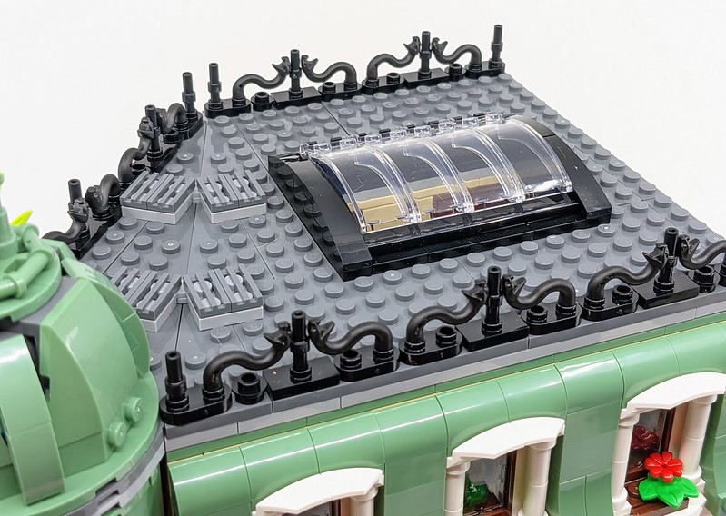
Enjoy hours of immersive building as you craft the model’s 5 sections. With unusual triangular geometry and elegant decor, it’s inspired by opulent turn-of-the-century European architecture. Build the guest rooms and penthouse suite, lobby, terrace and staircase. Then explore all the stories packed within, including fun tributes to other models in the LEGO Modular Buildings collection. With 5 sections, including the roof with its decorative dome and skylight, plus never-seen-before elements and colours, it’s sure to delight adult builders.
- Set Name: Boutique Hotel
- Set Number: 10297
- Pieces: 3066
- RRP: £179.99/$199.99/199.99€
- Measurements: measure over 39cm high, 25 cm wide and 25 cm deep
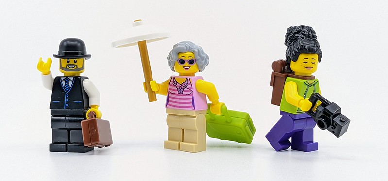
- Minifigures: 2 x Hotel Employees, Gallery Owner, Coffee Cart Vendor, Backpacker, Accountant & Glam Guest
- Availability: LEGO Stores & LEGO.com
Despite the varied nature of the Modular Buildings, each set features a couple of similar traits, which remain largely unchanged since the very first set. Almost every set is built upon a 32×32 baseplate and they feature Technic pins and relevant connector bricks, so each set can be connected together in various configurations. They also vary between face-on buildings and corner ones. Another trait every Modular building has is the use of usual parts to create intricate details. This is why the sets have become so popular. But the Boutique Hotel also celebrates 15 years of Modular Buildings. Which you’ll learn about as you build.
So the Boutique Hotel’s format is a little different compared to other sets. It feels slightly like a front-facing building but is actually a corner build. This is achieved by the building being built at an angle. It also features two buildings, the bulk of which is an ornate hotel but it also includes a small art gallery, topped with an outdoor eating area.
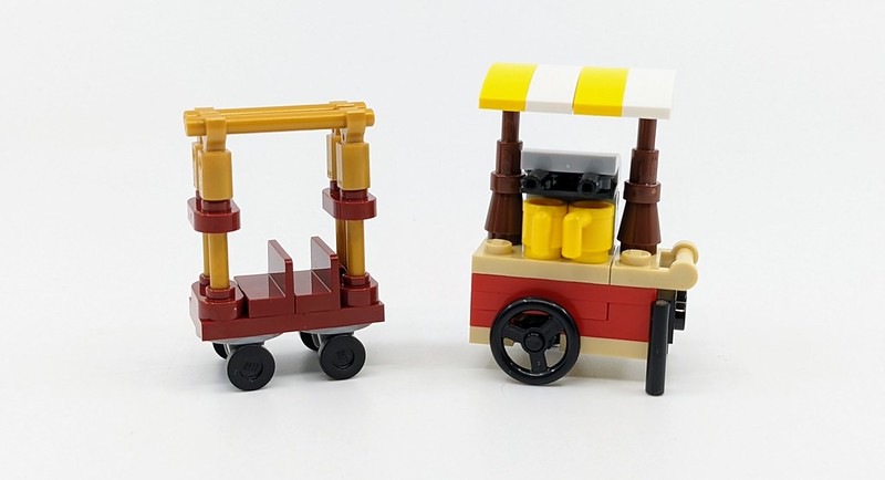
As mentioned above, the set marks the 15th Anniversary of the LEGO Modular Collection, as it’s now known. This milestone is celebrated throughout the set, with little nods to past buildings. These can range from a single element such as the white croissant or build techniques such as the yellow and white canopy on the coffee cart. As you build the set, these little Easter Eggs are noted on certain pages. Here’s just a couple you can expect to find in the set.
- White croissant – Parisian Restaurant
- Reception Phone – Police Station
- Art Gallery Bust – Town Hall
- Reception Artwork – Parisian Restaurant
- Notice Board – Detective Office
- Typewriter – Police Station
- Robot Arm Chair – market Street Railings
- Minifigure Skeleton Legs Balcony – Greengrocer Balcony
- Coffee Cart – Cafe Corner
As with all Modular Buildings, the build kicks off with the baseplate. Here you’ll be tasked with creating the foundation for the building as well as the interior flooding and exterior pavement. This is always a rather involved step as the floor needs to look fancy but also be functional in terms of connecting additional details and Minifigures. For this particular building, the base also needs to provide an anchor point for the unusual angle of the main building. Despite this, the means to connect elements in unconventional ways are as complex as some other sets I’ve built. However, it does slightly affect the upper levels but only in the early stages of their construction.
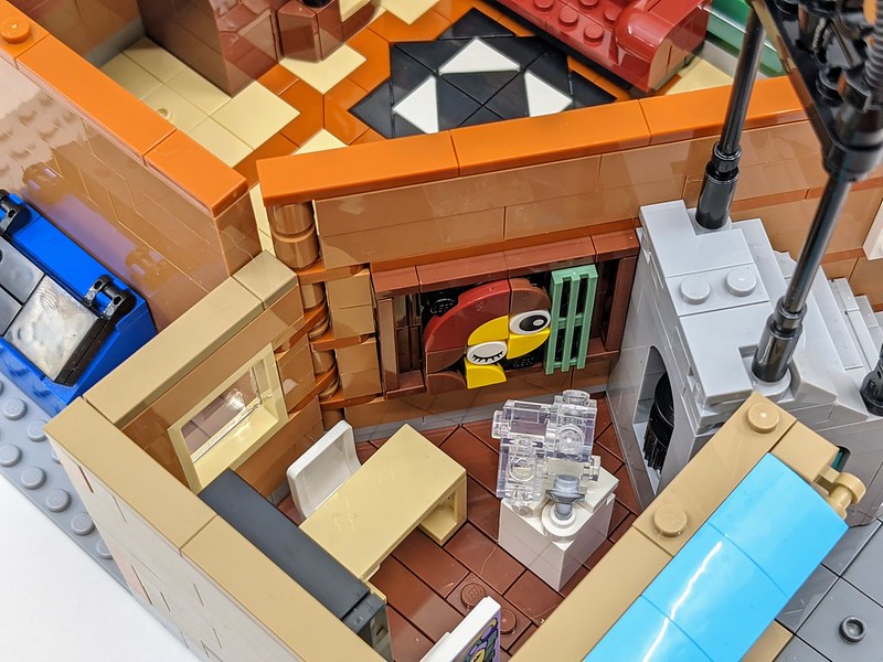
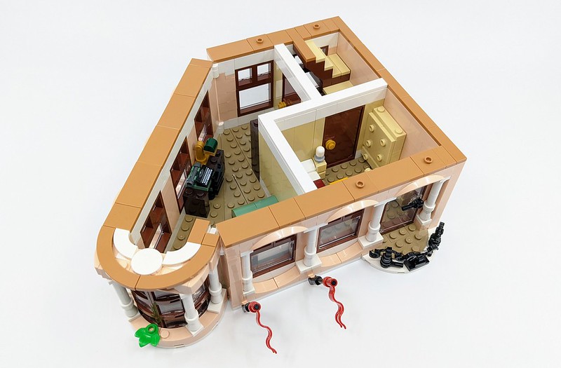
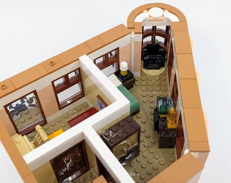
So the ground floor of the building is the most detailed due to the addition of the art gallery. Although the gallery is very small or cosy if you prefer, I love how the wall which borders both aspects of the ground floor has been used to cram in some extra detail. A section, which sits within the structure of the wall, has a piece of art on one side and also acts as a key cabinet on the other. This is a great use of space and acts as a great piece of detail which wouldn’t be as impressive if done separately. Building partly into the wall also ties the check-in desk within the hotel’s reception.
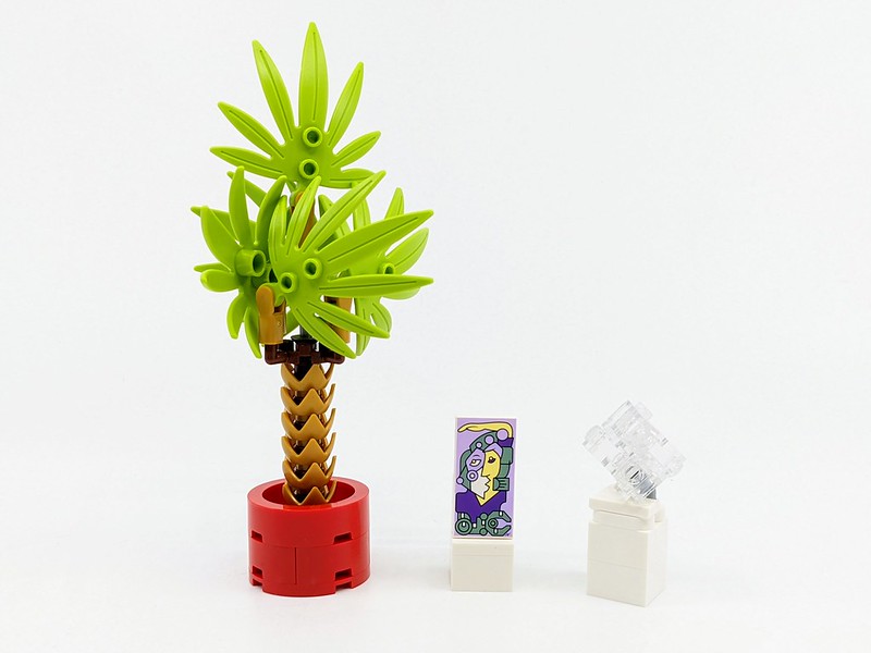
Although the rest of the reception area is quite sparse, next door in the art gallery there’s plenty going on. As well as the artwork on the wall mentioned above, there’s a painting on a plinth, a sculpture in the wall and a very familiar piece of artwork sitting on another plinth. This is a physical recreation of the old and now retired LEGO Creation Expert logo. It may no longer be in use but is a clever nod to the theme’s past.
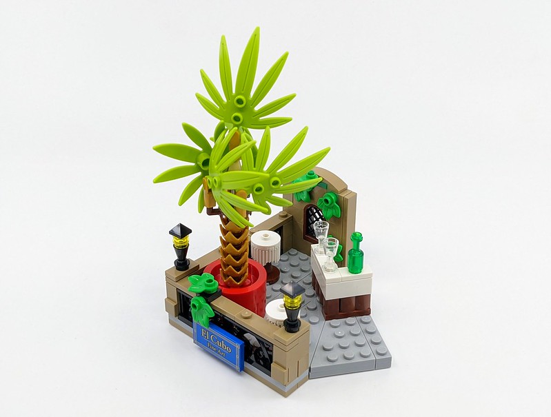
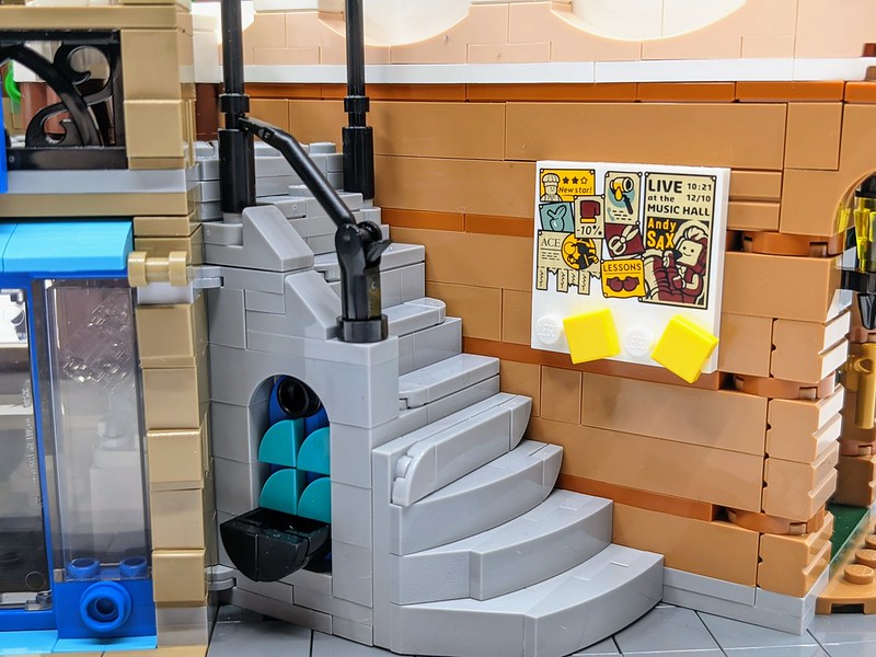
Directly above the art gallery is a rooftop dining area. Again, this is a small section, which has the same footprint as the gallery below. But there’s plenty of details to discover. The railings leading up to the roof makes clever use of elements you would normally associate with other uses. Turns out a crowbar and handcuffs make for perfect LEGO versions of iron railings. On the roof is a small bar and a couple of stalls but the focal point is a big palm tree (fun fact – this was used as the code name for the set). A stack of crowns or broken eggshell pieces and studs make a great trunk for the palm. Which is topped with a collection of large leaf elements.
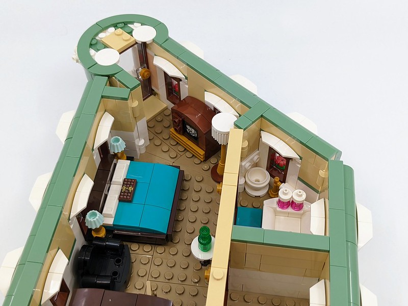
The second and upper floors of the main building are dedicated to the hotel’s various rooms. Now, this is a rather swanky hotel, so although it has rather limited occupancy, the second floor features two rooms, with the upper floor being a penthouse of sorts, with its own ensuite bathroom. The rooms themselves aren’t that exciting; their configuration is dictated by the overall building. However, they are filled with some great minibuilds. Which are another much-loved trait of Modular Buildings. Unsurprisingly, the furnishings are themed towards things you’d find in a hotel, such as beds, cabinets and seats. But my favourite is a retro TV. I particularly like how a screen has been achieved with a printed plate. In fact, all these small builds really do make great use of parts to create unique details.
The use of parts is just as important across the exterior of the hotel. Each floor of the hotel features distinct colours and designs, as well as different architectural flourishes. The ground floor is largely built from nougat masonry bricks with large windows to the right of the entrance doorway. To the left is a stairway to the rooftop area as well as the art gallery. Despite being on the same level as the hotel reception, it uses different coloured bricks and different build styles.
Moving up a floor and the colour changes to a fairly underused colour light nought. Although a quick check of how many sets this colour is used in will bring up numerous results, it is largely used on flesh coloured Minifigures and Mini-dolls. It’s not often used for LEGO bricks, meaning quite a few of the elements appearing in this set are making their debut in this colour. Because of this, it gives the hotel a unique feel as it’s not a colour you see much in this setting. The top floor of the hotel switches the colour again, this time using a light green colour for much of the brickwork, mixed with white trimming. This colouring also extends up to the focal point on the roof, which is a classic dome section.
But it’s the little flourishes on each of these sections which really impress. Stacked candle sticks perfectly frame each window. NINJAGO snakeheads become ornate railings. It’s this usual use of elements that really makes me smile when building a set and they are so prevalent in the Modular Buildings.
Any good hotel needs guests and people to welcome them. The set includes two employees, who are kitted out in classic-looking ‘bellhop’ uniforms. These are a mix of dark green legs and a light green torso. They match the classic feel of the hotel. The rest of the characters are a mix of previously used parts. They include a Coffee Cart worker, backpacker, accountant and a glamorous guest, plus a young lady who I’ve assumed is connected to the art gallery. Some of the guests have appeared in past Modular Building sets, although the may look a little different due to the use of updated Minifigure faces compared to the simple classic ones used in earlier sets.
The Modular Buildings continue to provide a unique and enjoyable build experience. This is a nice celebration of the theme’s 15th anniversary, whilst still providing something new. I love all the little builds which expand on the set’s attention to detail both inside and out. It’s difficult to find things wrong with the set, for some the different coloured layers could be an issue, but I quite like it. I would have liked the Minifigures to have been a little more unique, maybe connected more to past sets, but apart from that the Hotel Boutique lines up nicely with past sets as well as being a great set in its own right.
Coming Soon: UKIrelandUSCanadaGermanyDenmarkAustraliaNew Zealand
This set was provided to BricksFanz by the LEGO Group for purposes of review. The thoughts within this review are that of BricksFanz and do not reflect those of the LEGO Group. Providing a set for free does not guarantee a favourable opinion of the set.


